# Page Styles
RHCore includes a cascading style sheet (CSS) to render tables in a style consistent with Content Server. The stylesheet can be used in any HTML rendering context (RHTemplate, WebLingo, WebReports, etc.).
The stylesheet also contains a number of helper classes (e.g., alignRight, floatLeft, width100, etc.) for formatting.
The stylesheet is located at support/rhcore/core/rhcore.css. An alternative support/rhcore/core/rhcore-16.2.6.css is included that adheres to some of the UI changes in CS 16.2.6.
# List Views
A list view can be rendered with rhcore.css and looks something like the following:
<table class="rhtable rhstriped">
  <thead>
    <tr>
      <td class="minWidth">{% usemacro sortheader "subtype" "Type" %}</td>
      <td class="width70">{% usemacro sortheader "name" "Name" %}</td>
      <td class="alignRight">{% usemacro sortheader "size" "Size" %}</td>
      <td class="alignCenter">
        {% usemacro sortheader "modifydate" "Modified" %}
      </td>
    </tr>
  </thead>
  <tbody>
    {% for child in node.children|sort:request.sort %}
    <tr>
      <td>{{ child.img }}</td>
      <td>{% usemacro browselink child %}</td>
      <td class="alignRight nowrap">{{ child.size }}</td>
      <td class="alignCenter nowrap">
        {{ child.modifydate|date }} ({{ child.modifydate|timesince }})
      </td>
    </tr>
    {% endfor %}
  </tbody>
</table>
This renders as follows:
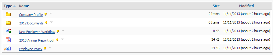
The main style is applied by the rhtable class, which cascades various styling rules to the table and its child elements. Namely, it:
- adds a border around the table;
- sets a grey background on the header row;
- adds a line below the header to separate it from the rows;
- removes the underline on the header sort links; and
- sets padding within the cells.
Additional presentational styles are used to do specific formatting:
rhstriped- alternates the row colours;minWidth- sets the width to 1%;width70- sets the width to 70%;alignRight- aligns the cell contents to the right;alignCenter- aligns the cell contents in the center; andnowrap- prevents wrapping of the cell contents.
# Detail Views
Detail views (or property views) are also possible:
<table class="rhtable rhproperties">
  <tbody>
    <tr>
      <td>Key A:</td>
      <td>Value A</td>
    </tr>
    <tr>
      <td>Key B:</td>
      <td>Value B</td>
    </tr>
  </tbody>
</table>
This renders as follows:

The rhproperties class supports multiple columns by adding additional columns:
<table class="rhtable rhproperties">
  <tbody>
    <tr>
      <td>Key A:</td>
      <td>Value A</td>
      <td>Key B:</td>
      <td>Value B</td>
    </tr>
    <tr>
      <td>Key C:</td>
      <td>Value C</td>
      <td>Key D:</td>
      <td>Value D</td>
    </tr>
  </tbody>
</table>
This renders as follows:

A button bar can be added with a <tfoot> section:
<tfoot>
  <tr class="buttonBar">
    <td colspan="4">
      <input type="submit" value="Save" />
      <input type="reset" />
    </td>
  </tr>
</tfoot>
